Love Letter to the Southwest | Photography and Writing Zine
Capturing the beauty of the American Southwest through photography and a personal collection of writings/poetry, "Love Letter to the Southwest" showcases a deep appreciation for the barren desert landscapes during off-season months, accompanied by graphic collateral such as stickers and iconography to create a cohesive, branded "zine".
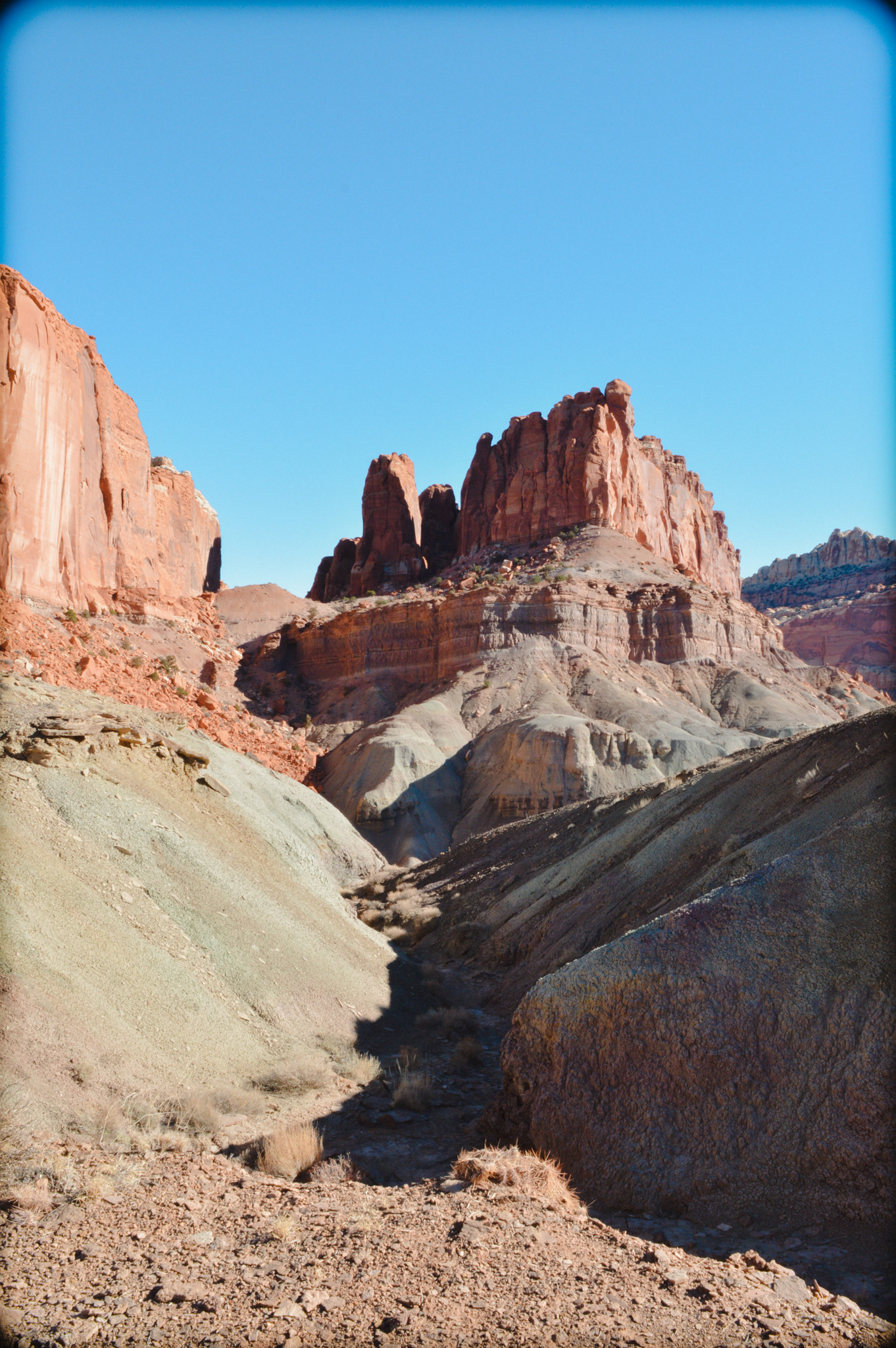
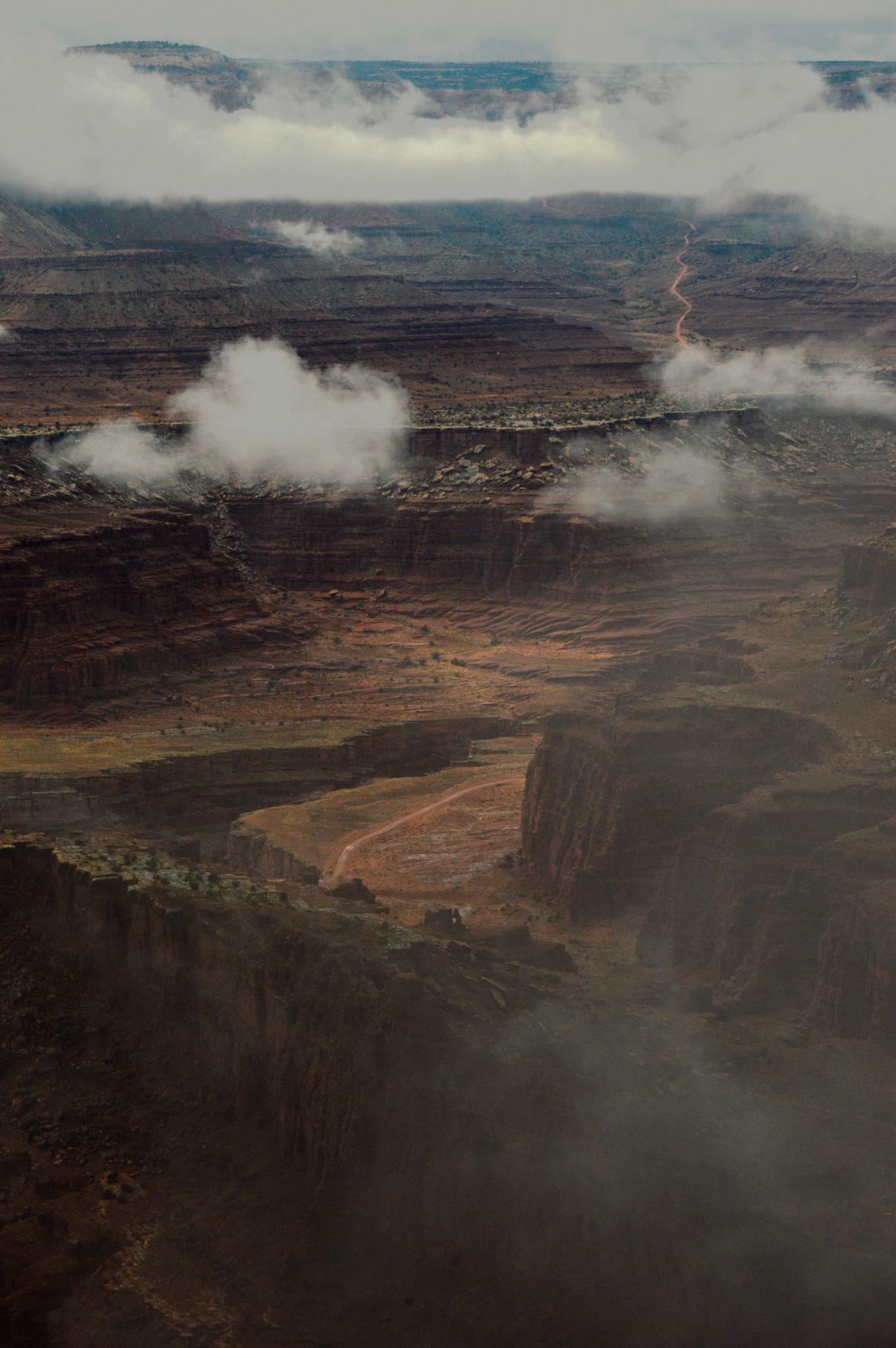
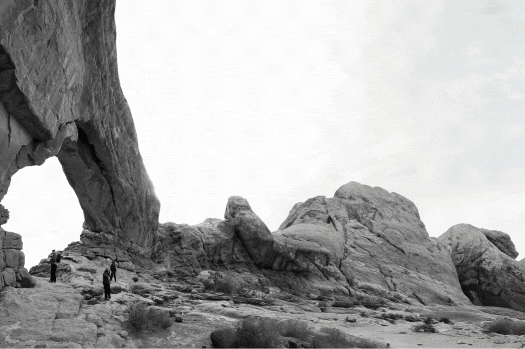
Photography
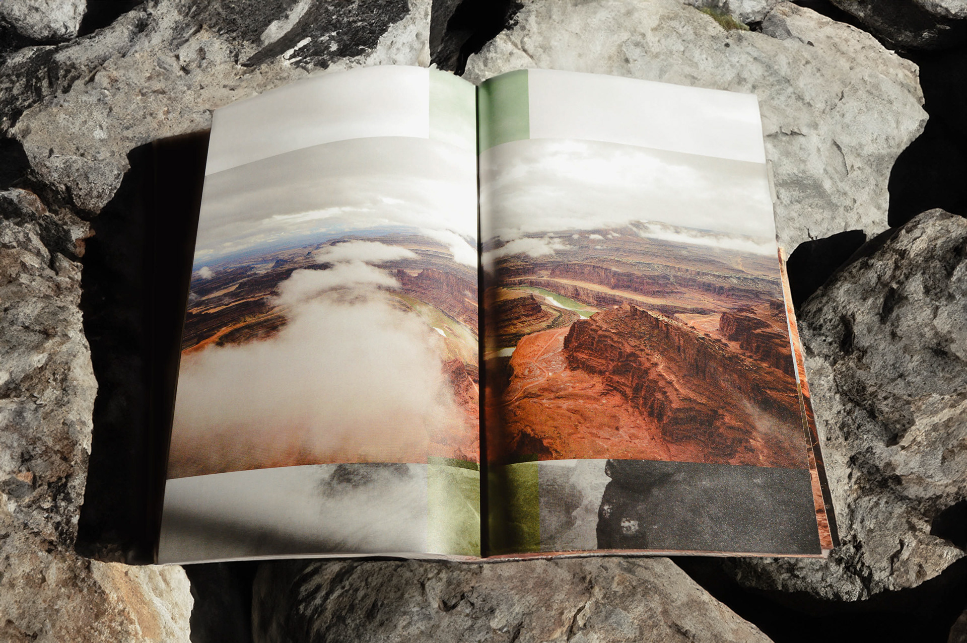
Collecting and narrowing down imagery was the first step in the process of creating the zine– with over 1,400 images from all 5 National Parks in Utah, and one state park, considerable cuts needed to be made to establish a concise story.
Collecting and narrowing down imagery was the first step in the process of creating the zine– with over 1,400 images from all 5 National Parks in Utah, and one state park, considerable cuts needed to be made to establish a concise story.
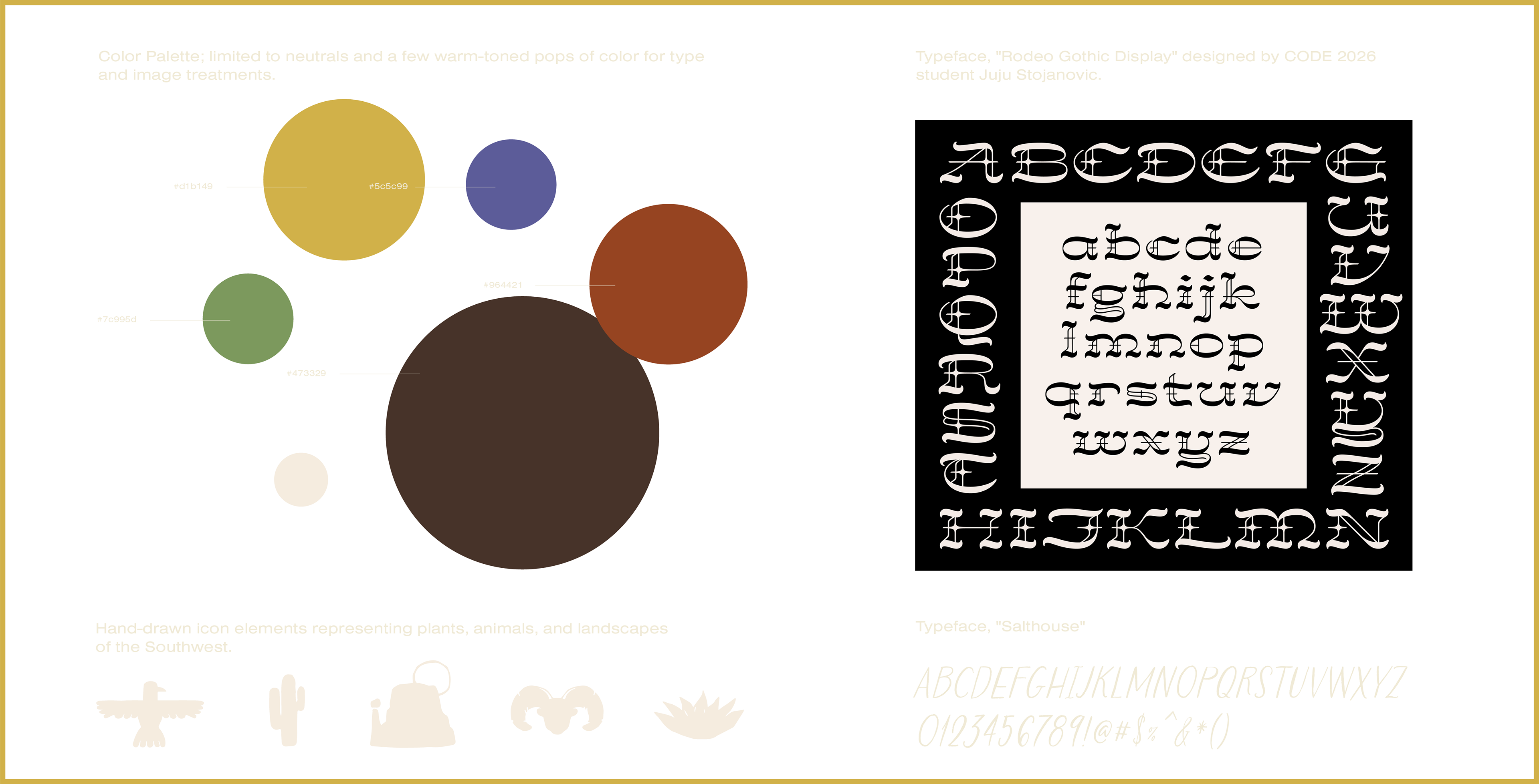
Identity
The zine, while maintaining a personal feel, needed a set of rules and graphic standards to further the imagery and create
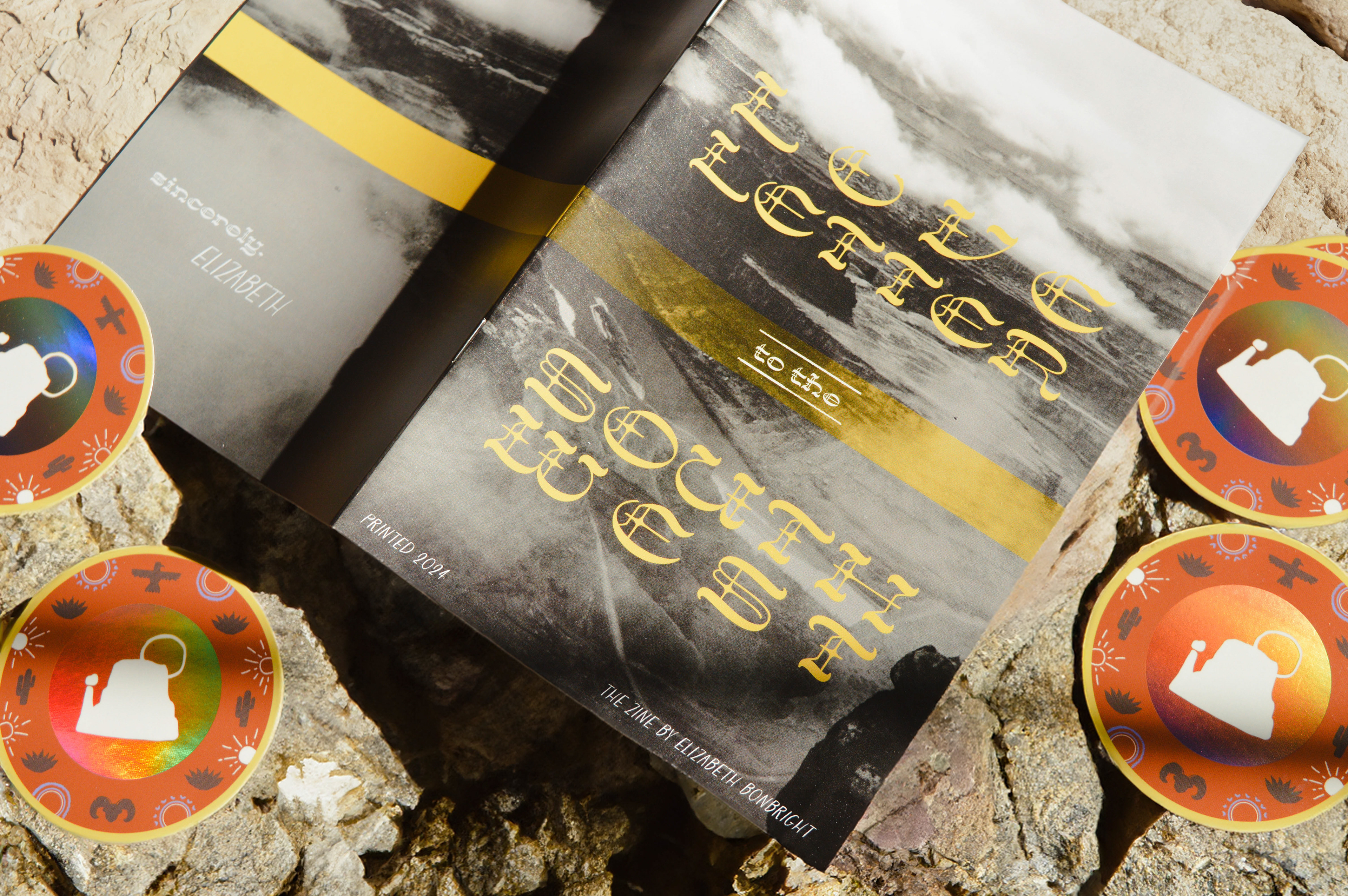
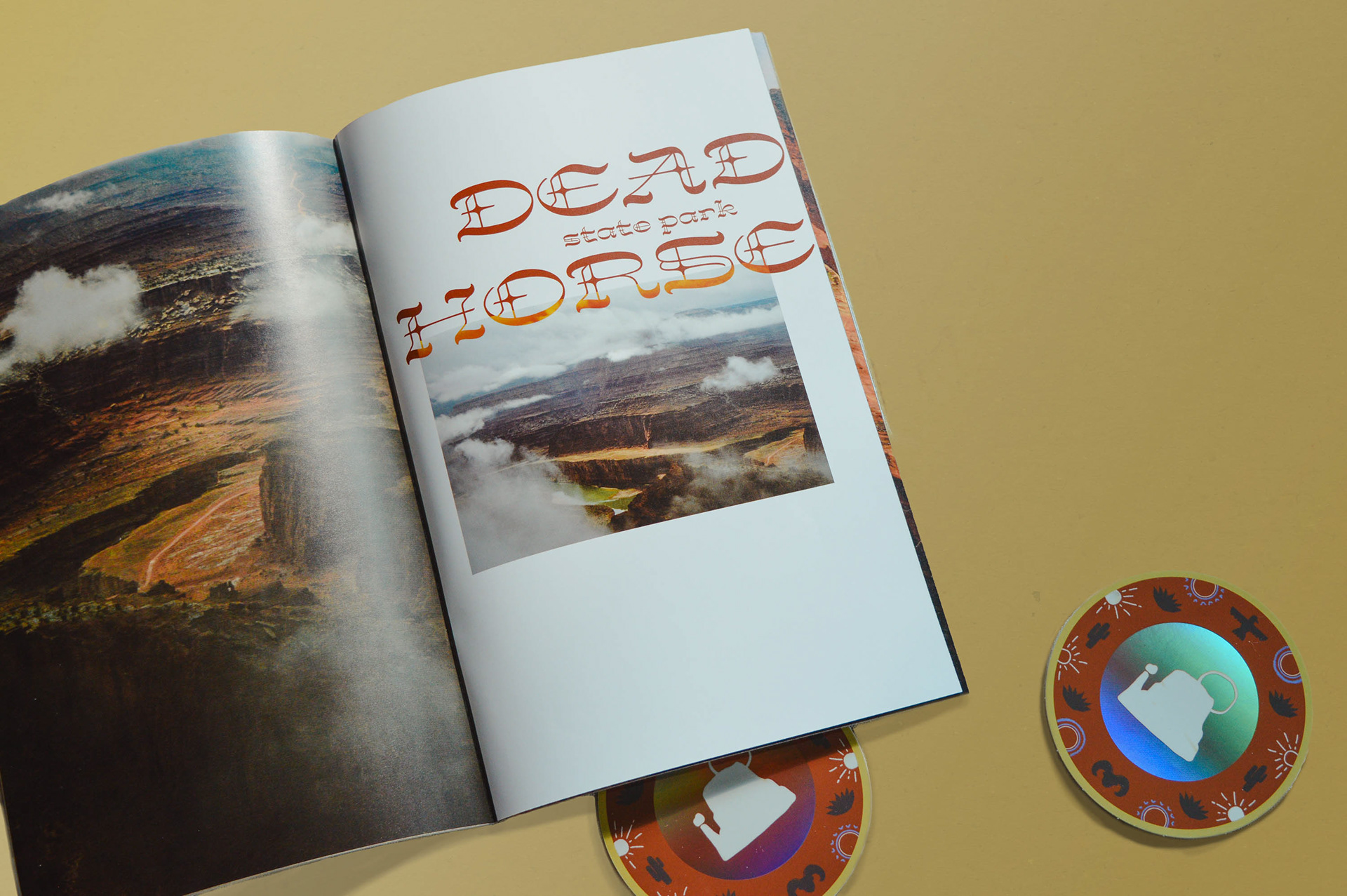
a sense of consistent identity. Colors from the natural landscape of the desert were utilized throughout the project to highlight images and the typography. A blackletter display font, with Wild West undertones was used for the cover and park titles.
The zine, while maintaining a personal feel, needed a set of rules and graphic standards to further the imagery and create
a sense of consistent identity. Colors from the natural landscape of the desert were utilized throughout the project to highlight images and the typography. A blackletter display font, with Wild West undertones was used for the cover and park titles.
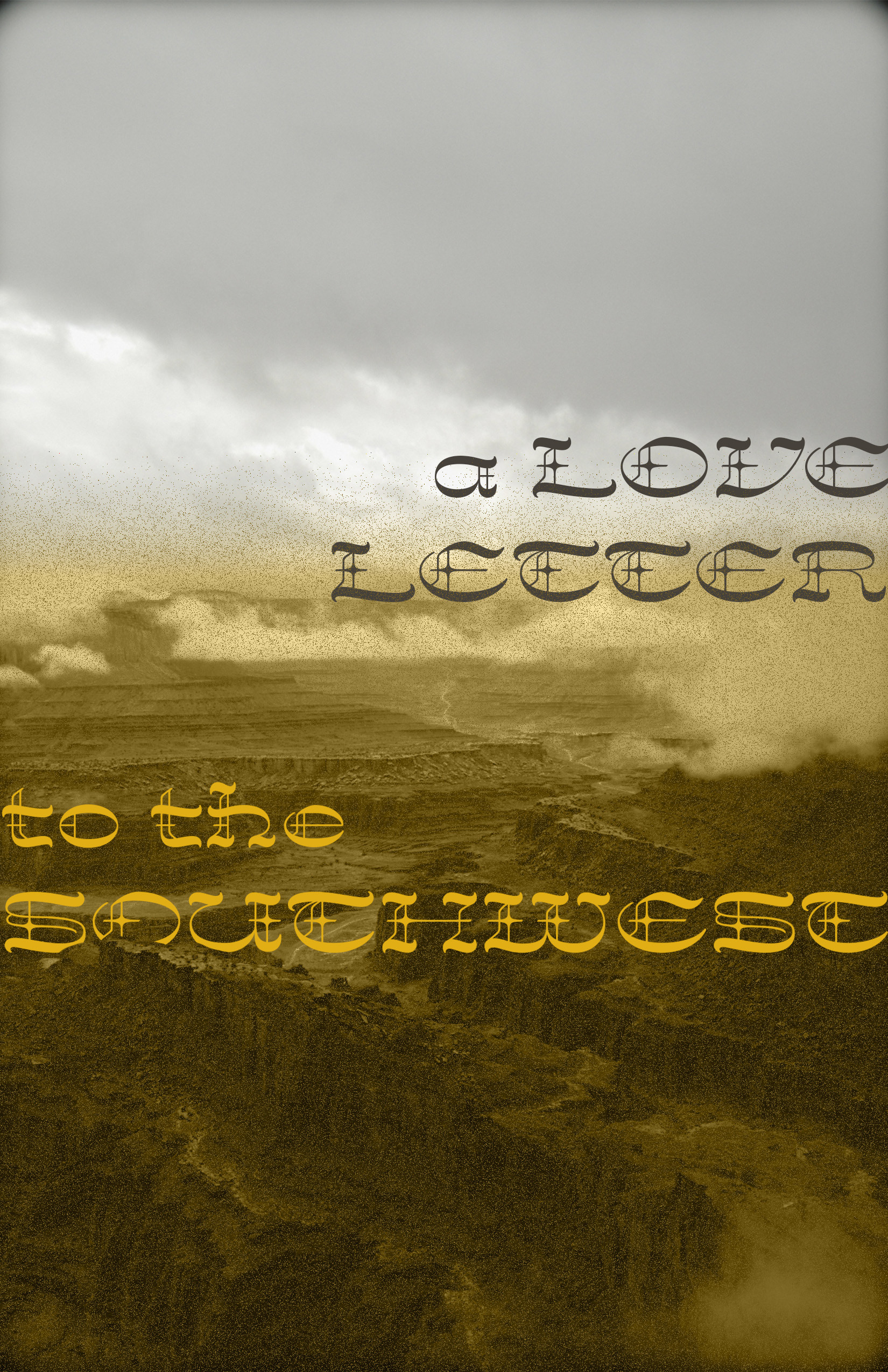
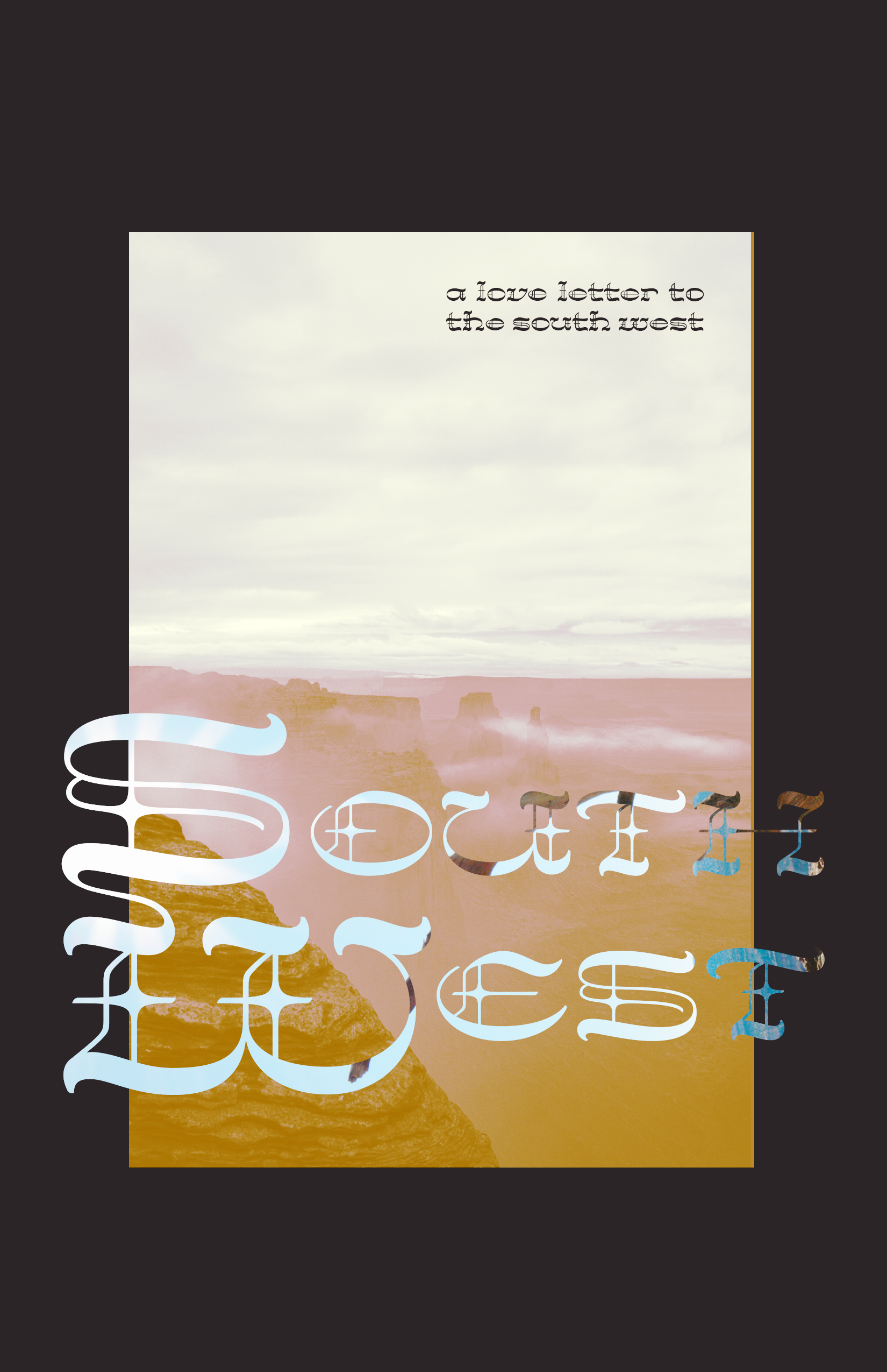
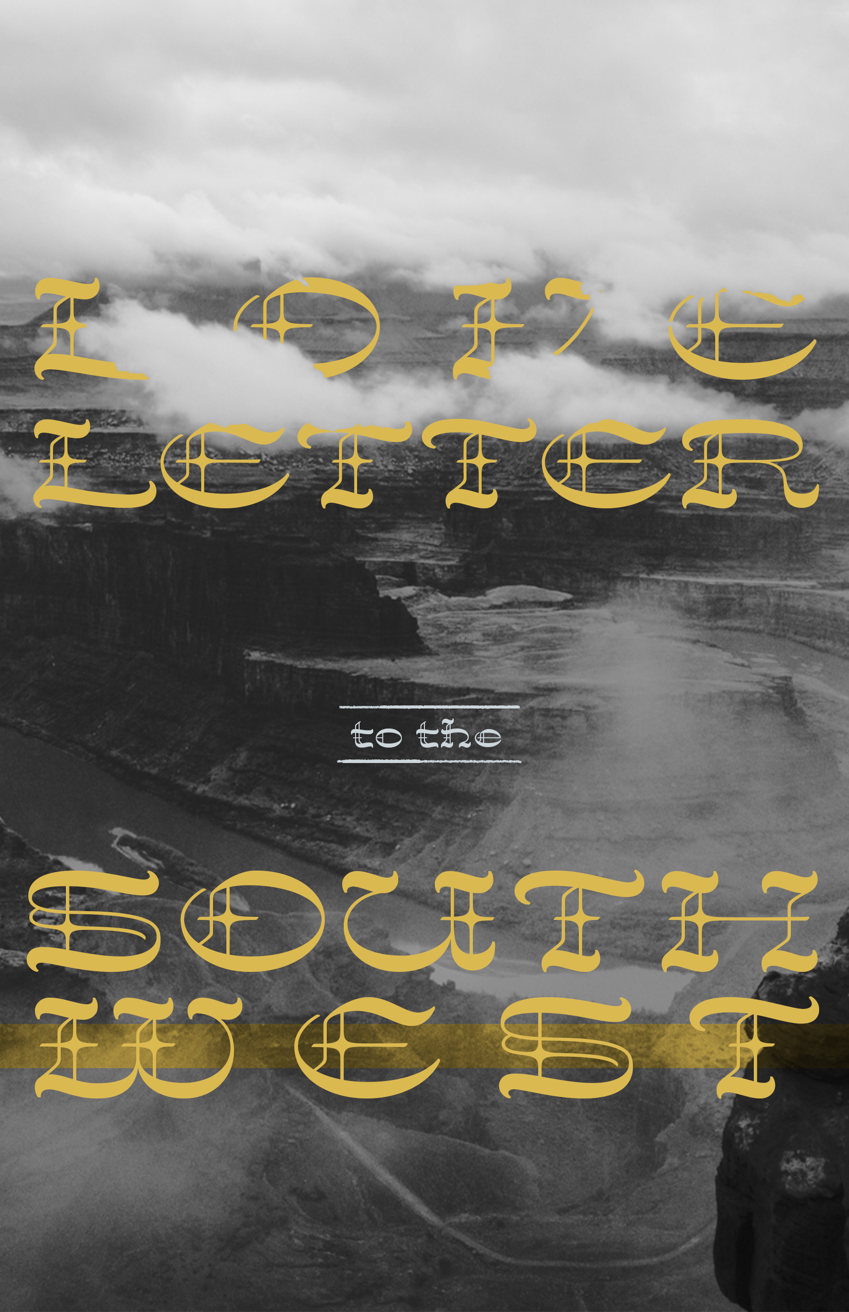
Cover Explorations
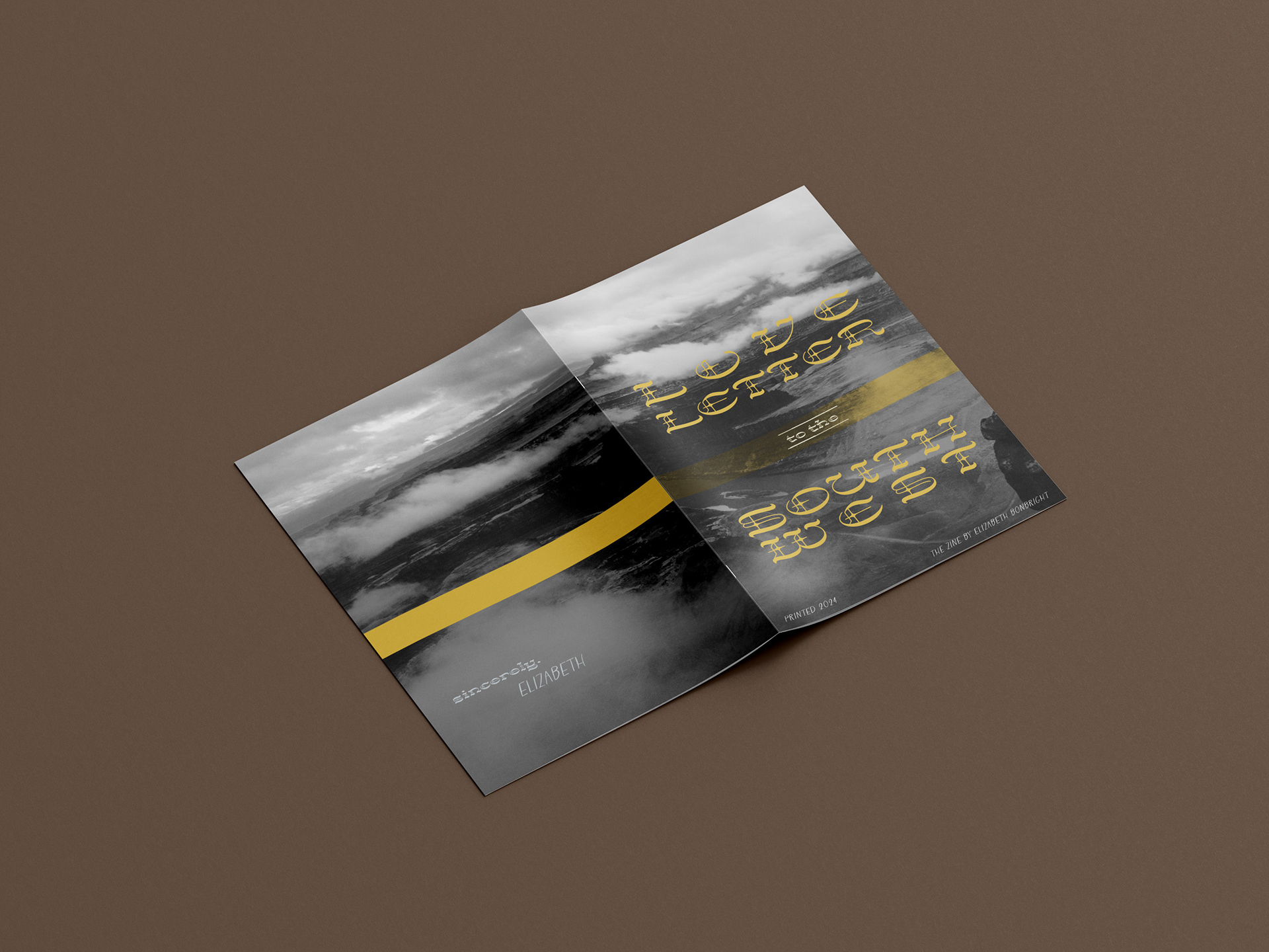
The covers went through multiple drafts, exploring a balance between type, imagery, texture, and opacity layers.
And finally, landing on a harmonious mix of Rodeo Gothic type and edited imagery.
The covers went through multiple drafts, exploring a balance between type, imagery, texture, and opacity layers.
And finally, landing on a harmonious mix of Rodeo Gothic type and edited imagery.
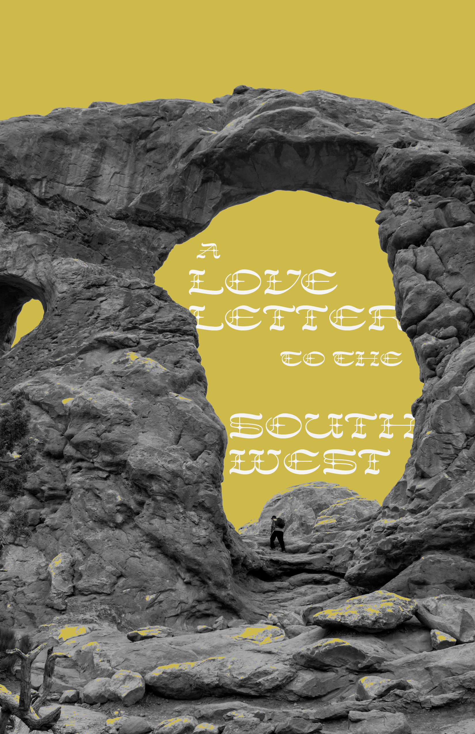
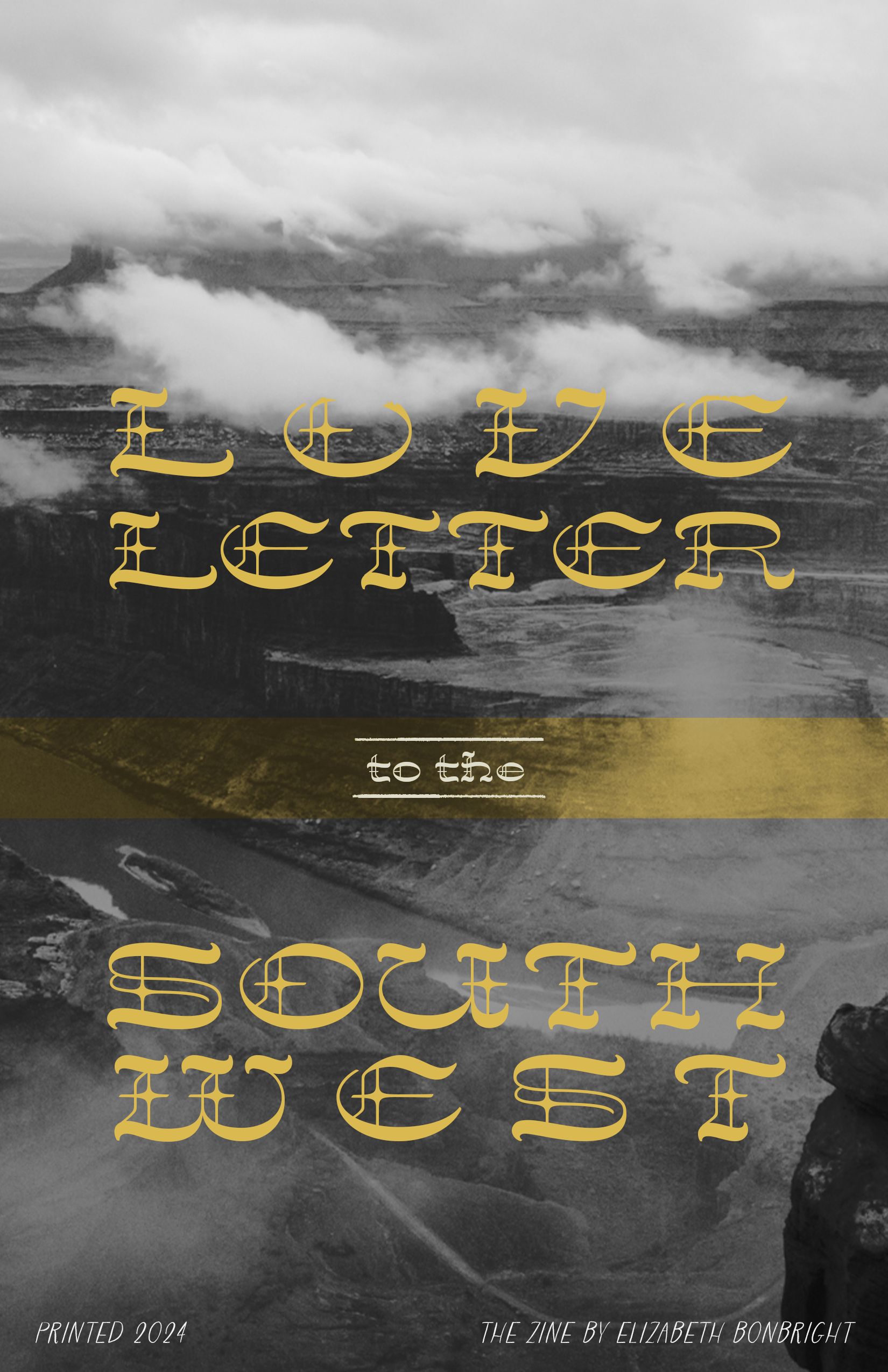
final front cover
Laying out the Spreads
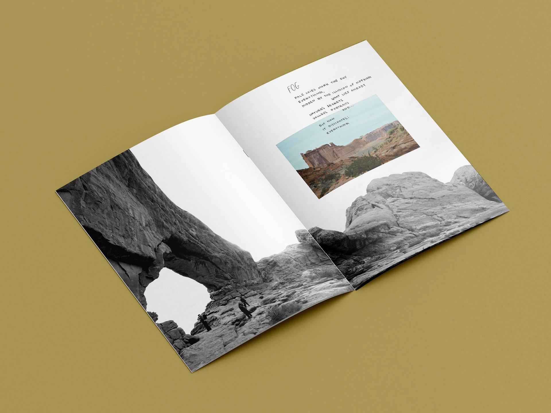
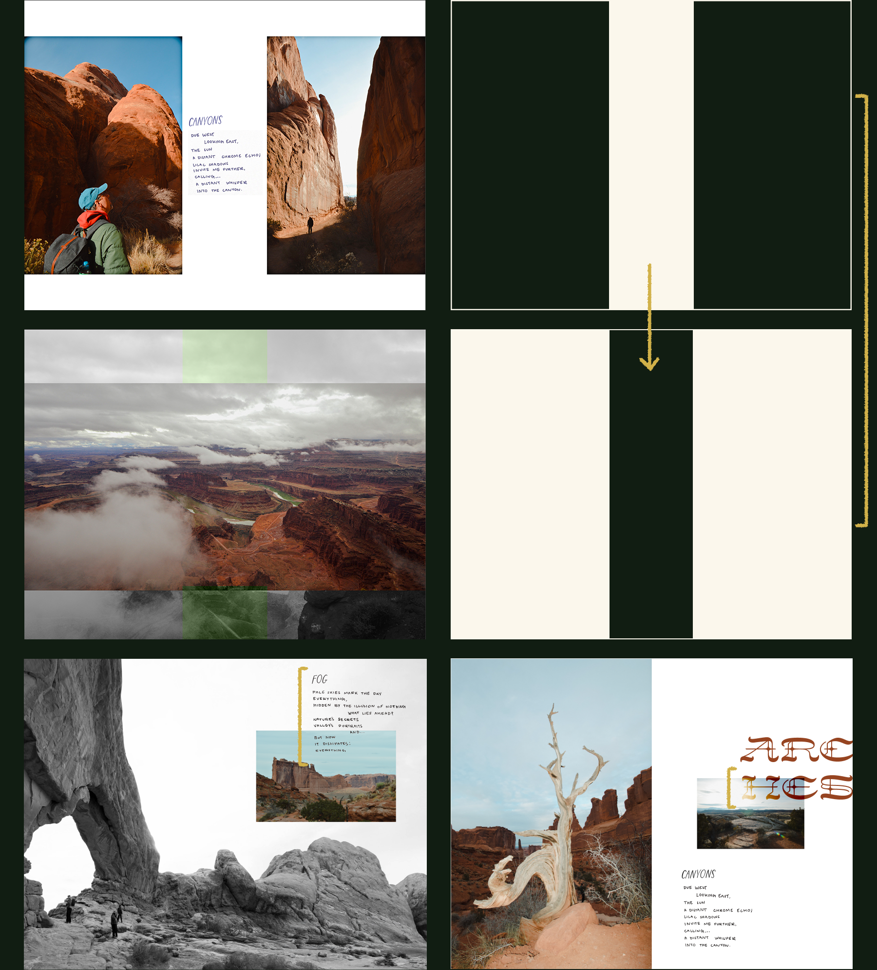
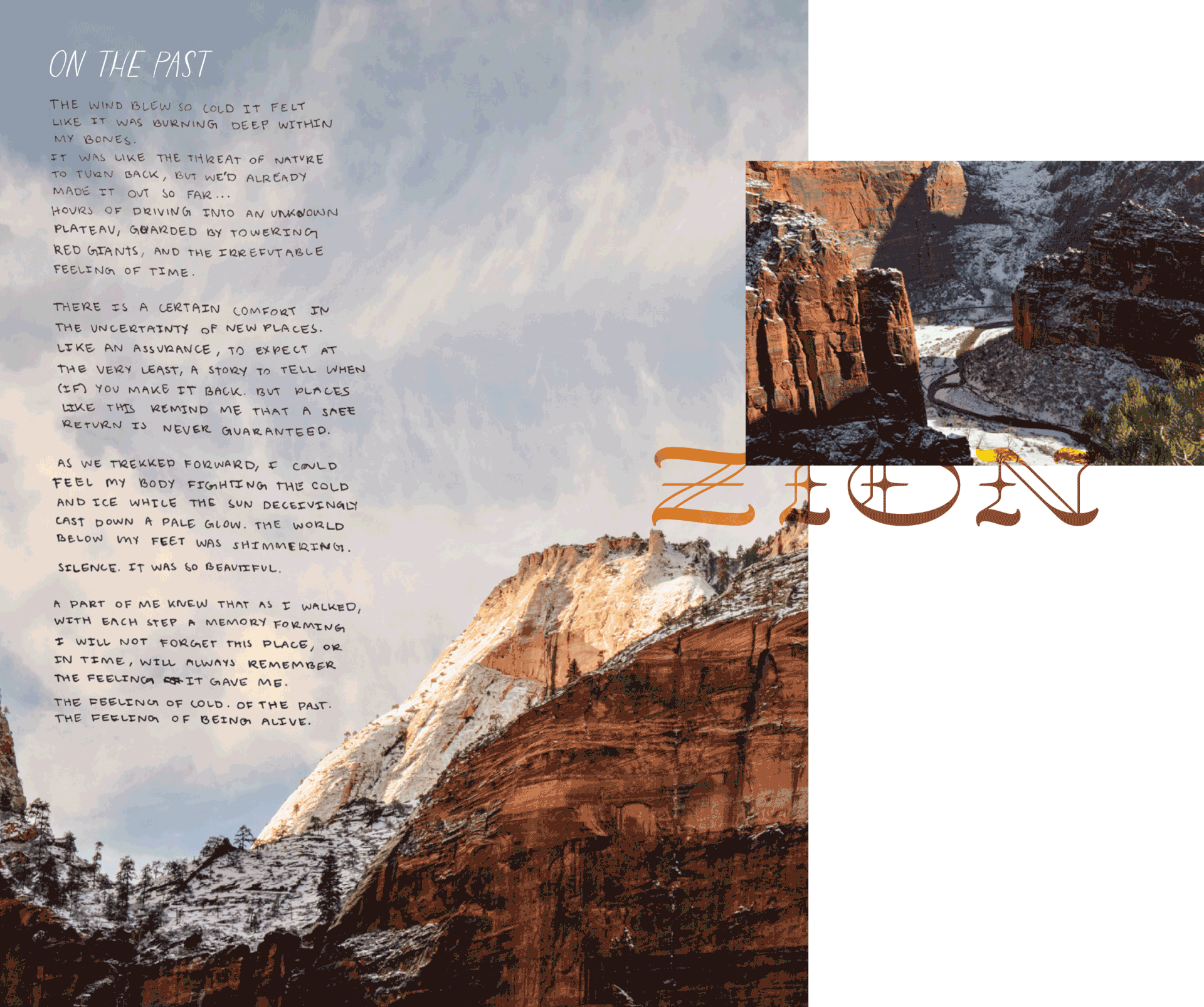
Finding the right balance of imagery, display type, and handwritten notes in the spreads took time and small tweaks, with to-scale printing between drafts to ensure legibility on the pages that were not solely focused on photography. Gestalt principles and the flow of reading for the viewer was also a consideration when laying out the zine.
Additional Collateral
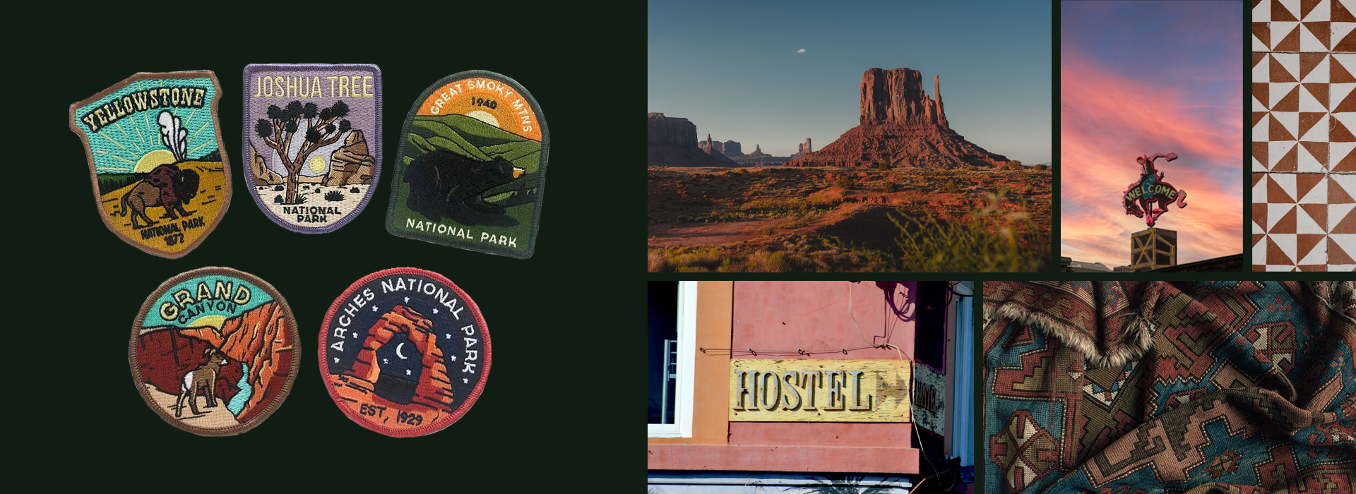
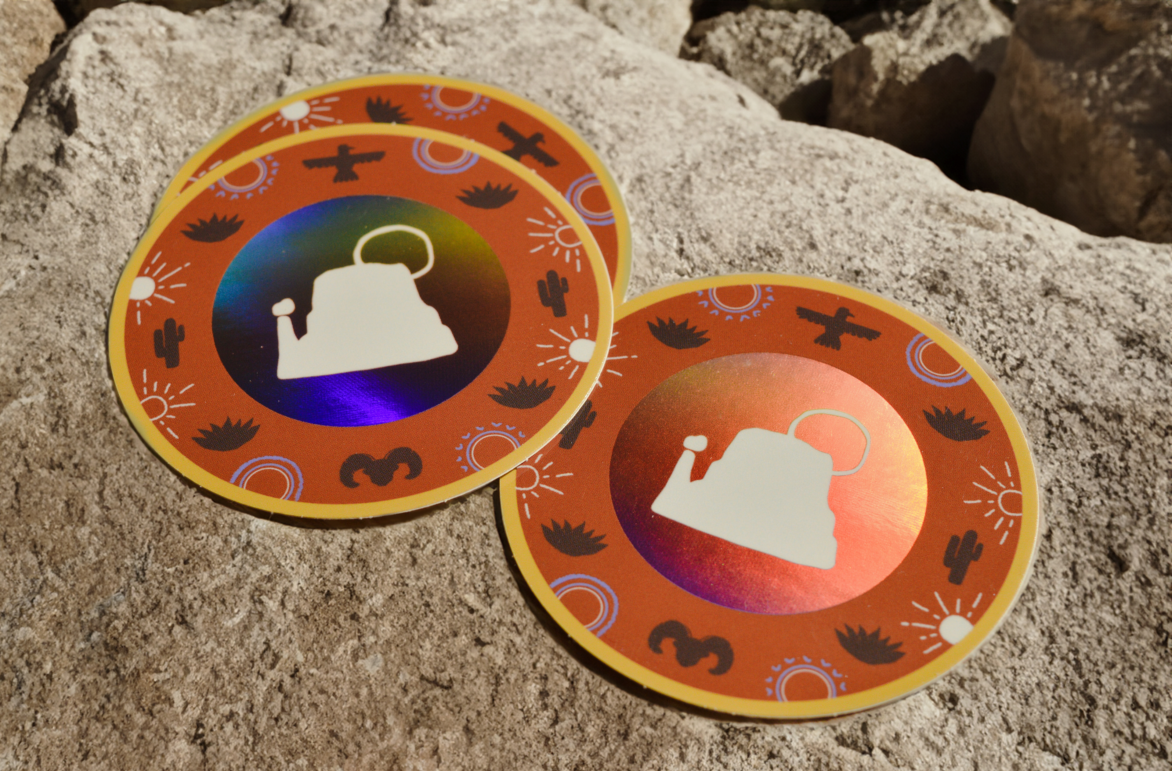
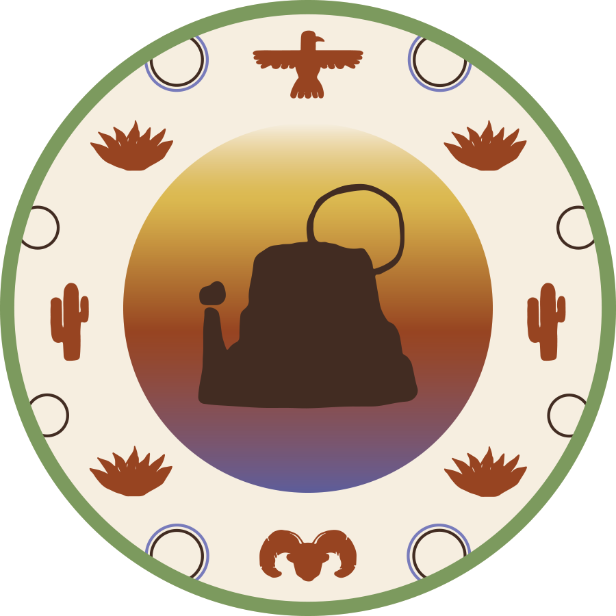
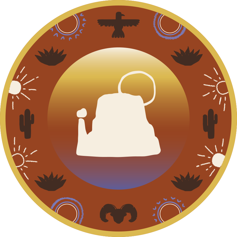
As part of exploring the medium of print, and wanting to further the identity of the zine, a set of stickers was designed to accompany the main booklet. Inspiration for the stickers was sparked by National Park badges and Southwestern style, utilizing the established identity to inform the design.
As part of exploring the medium of print, and wanting to further the identity of the zine, a set of stickers was designed to accompany the main booklet. Inspiration for the stickers was sparked by National Park badges and Southwestern style, utilizing the established identity to inform the design.
Final Print | Online PDF
To view an online published version of the zine, click below!