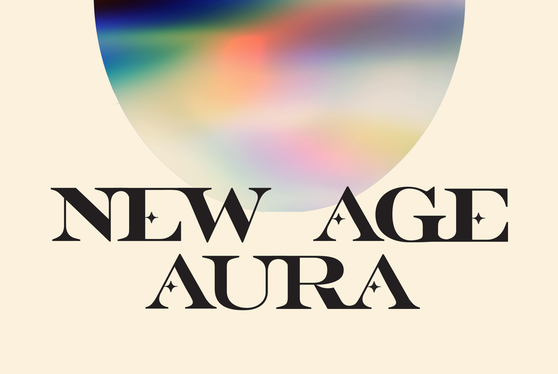
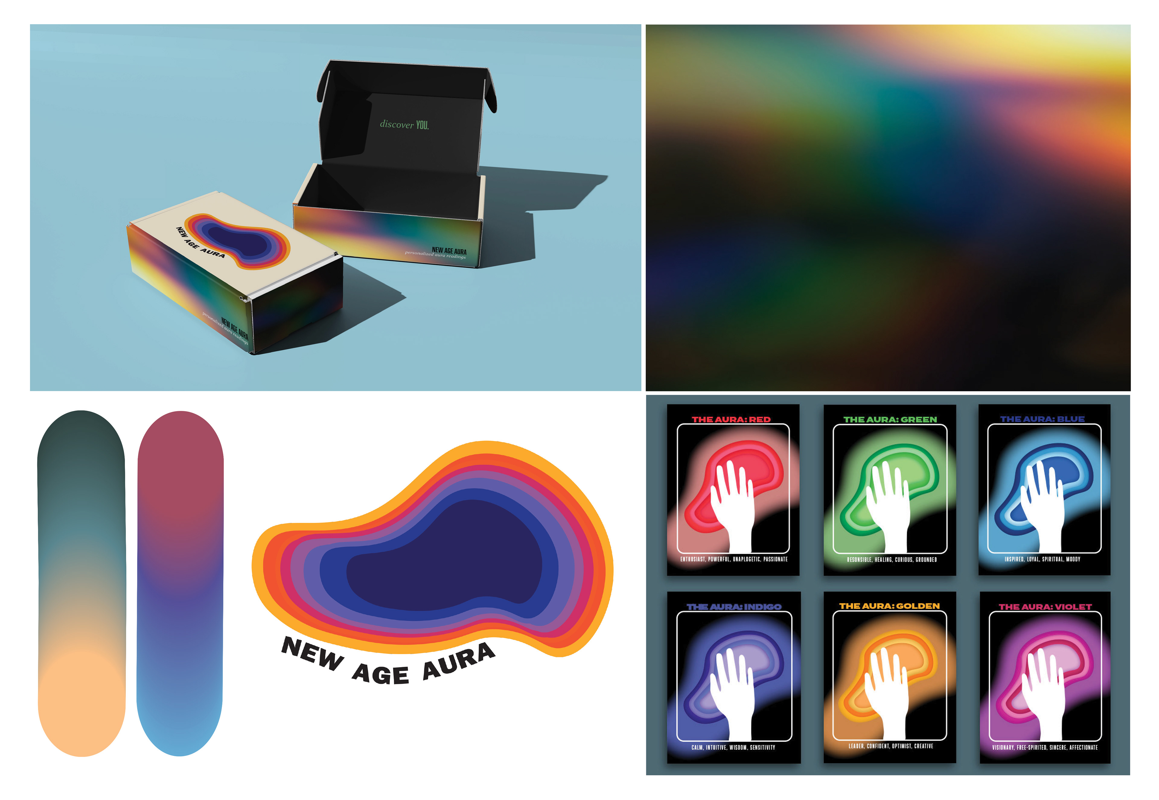
New Age Aura | Branding, Packaging
New Age Aura is a conceptual brand identity created to explore the spiritual
and scientific practice of aura reading, at home.
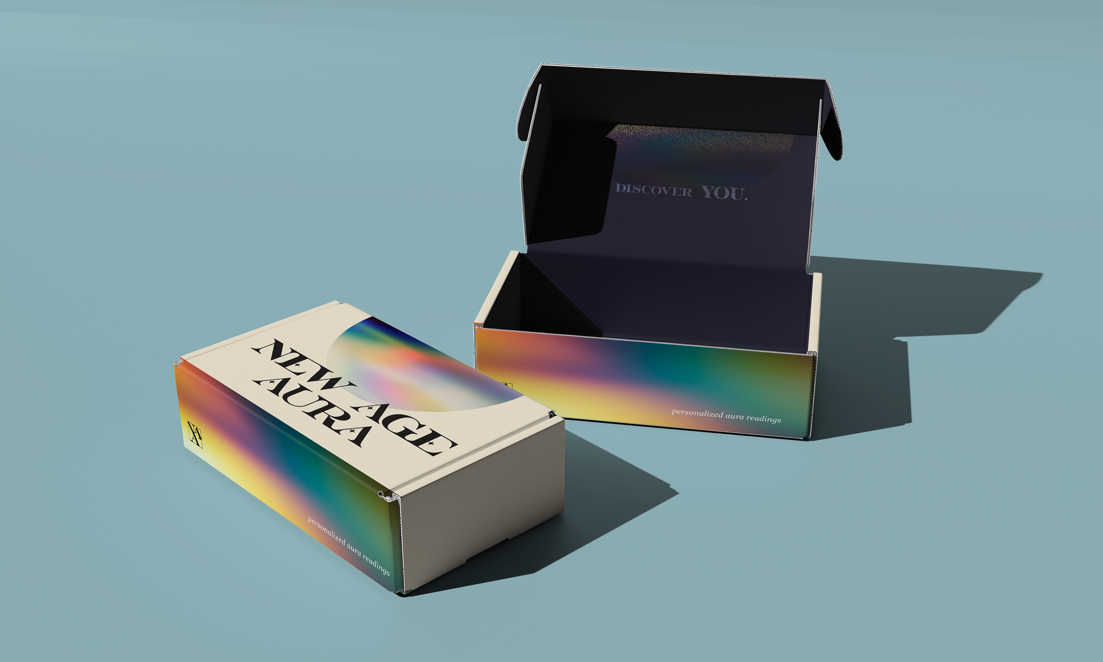
The brand strives to provide clients with an alternative to expensive aura readings and photography
that can all be done anywhere, with the same mystical feeling. New Age Aura does this through the use
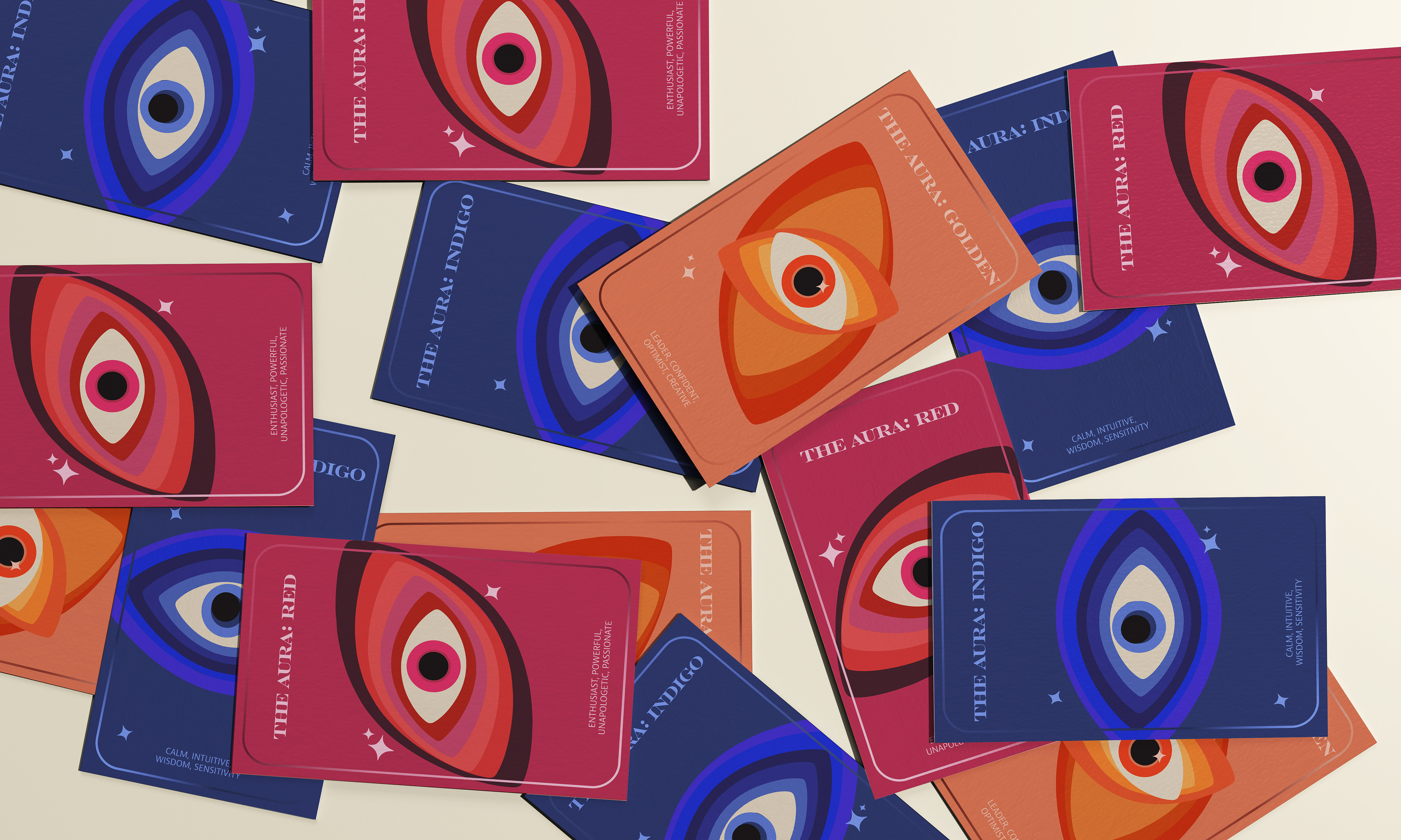
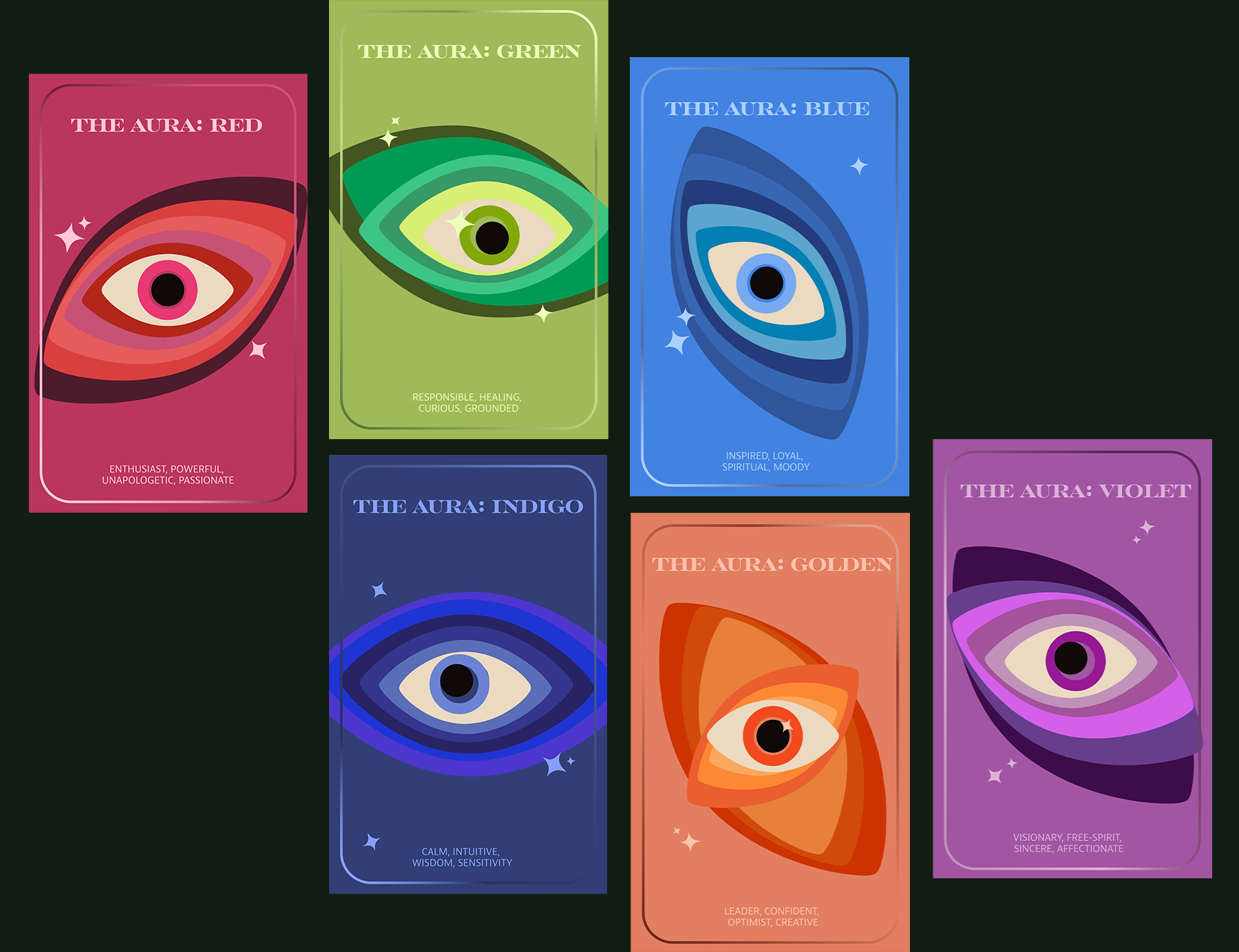
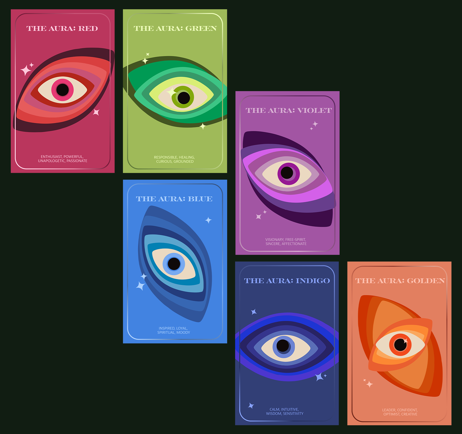
of descriptive cards, each with an individualistic design to represent those who use them.
and scientific practice of aura reading, at home.
The brand strives to provide clients with an alternative to expensive aura readings and photography
that can all be done anywhere, with the same mystical feeling. New Age Aura does this through the use
of descriptive cards, each with an individualistic design to represent those who use them.

Concept Research
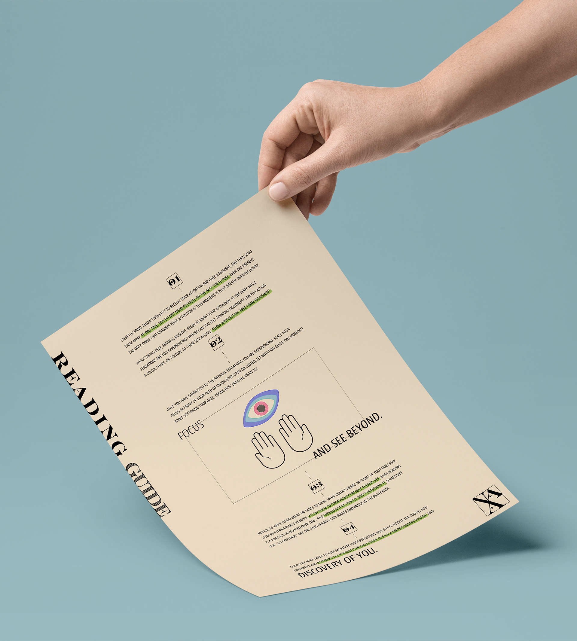
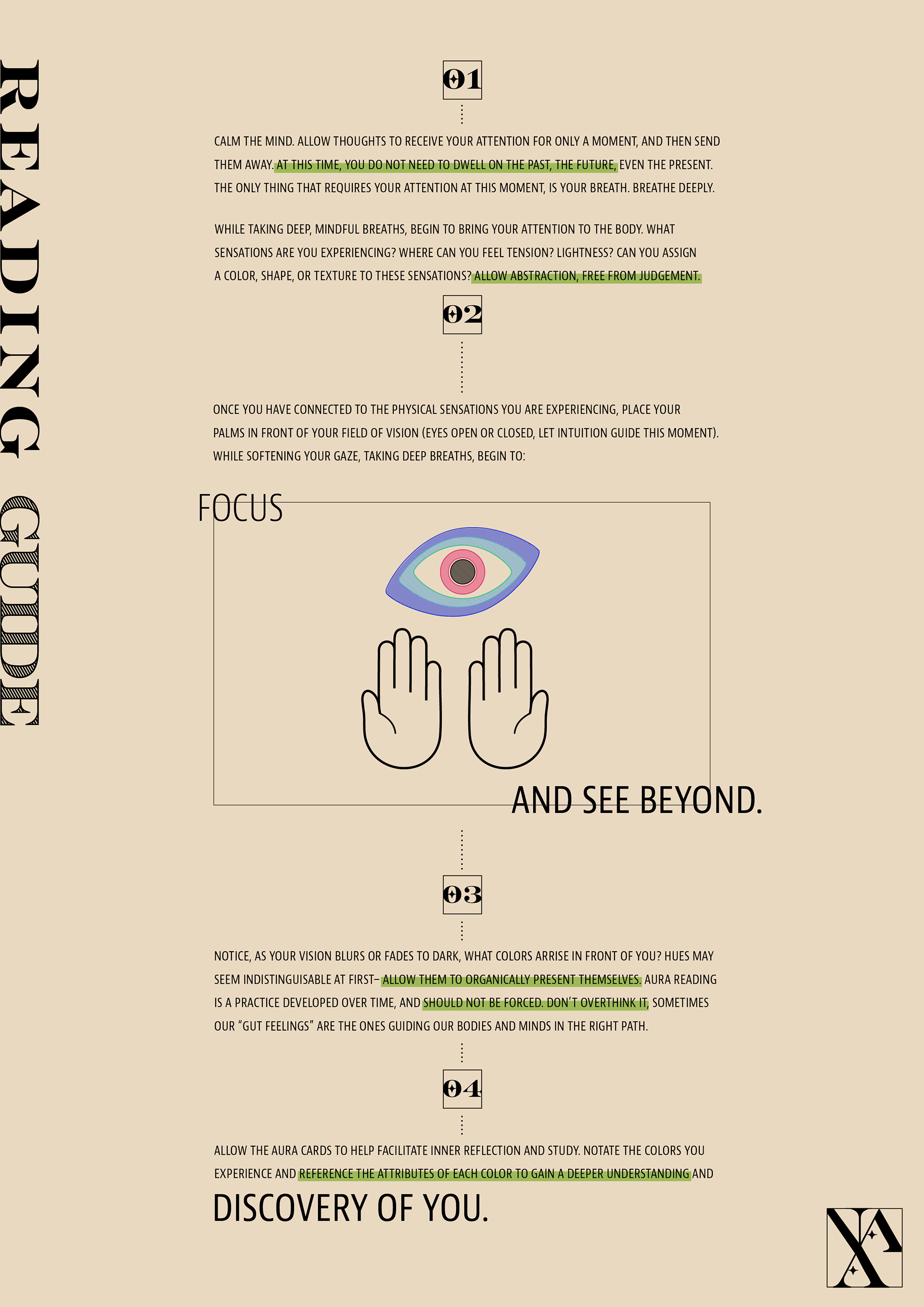
The aura is a physical energy created by vibrations surrounding every living being, often represented through variable hues. Auras
are an ever-changing energy and often represent the state of mind that someone is living through. Capturing and understanding one's auric colors can provide mental clarity, allow for reflection, or start meditative practices.
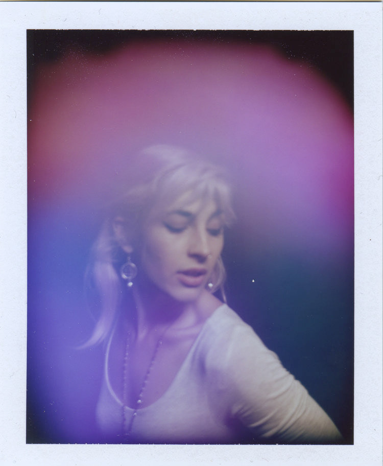
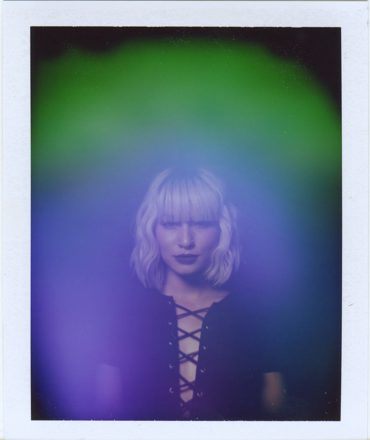
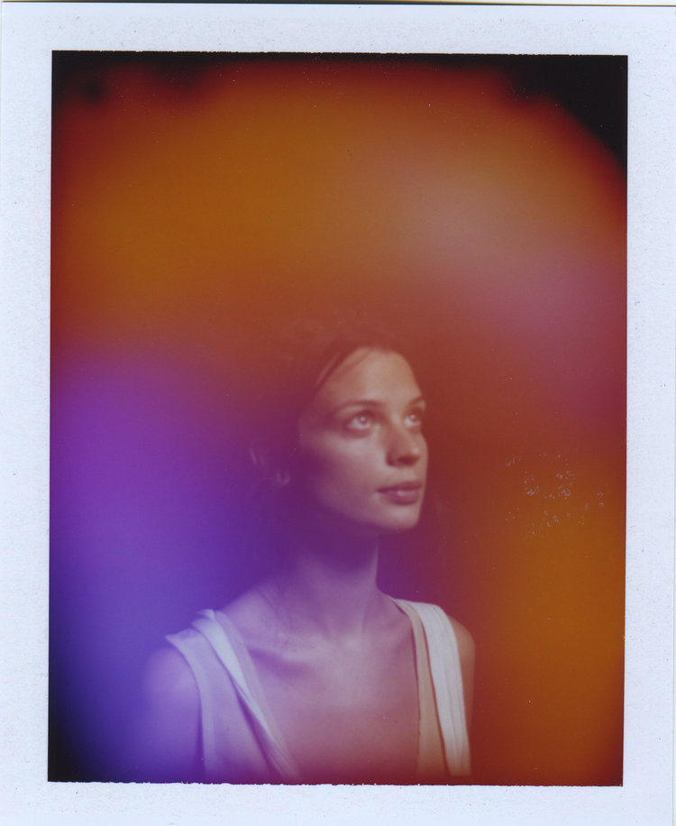
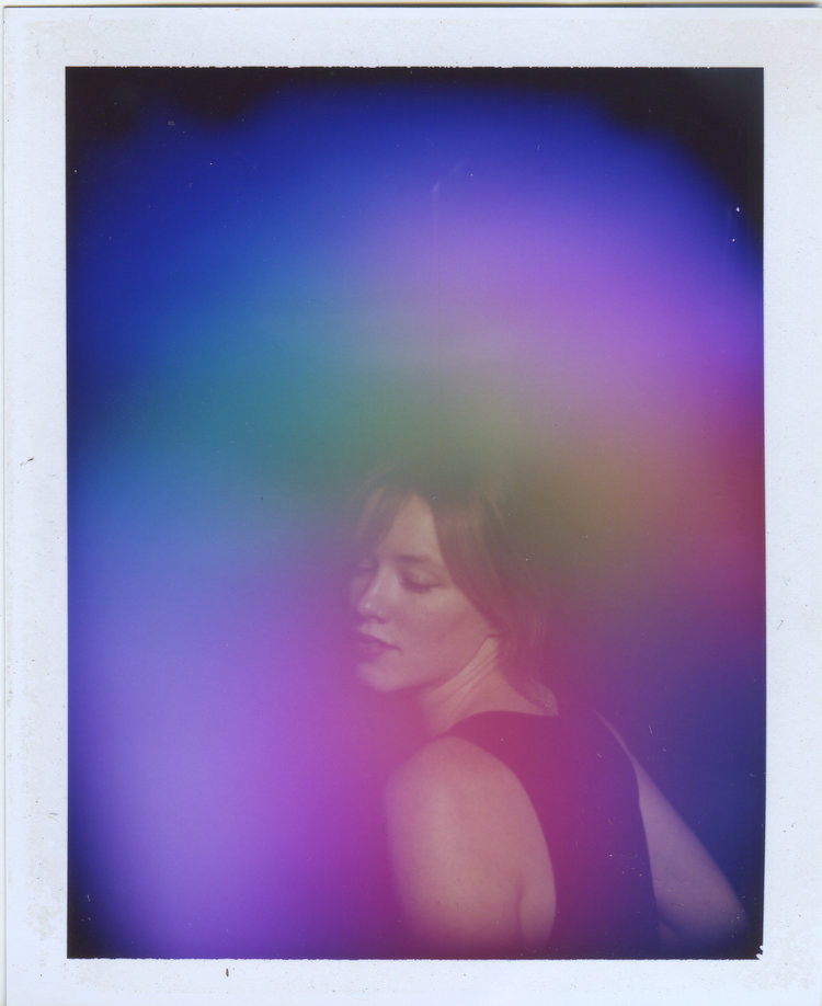
images taken by NY-based, aura photographer Christina Lonsdale (Radiant Human).
Version 1 (2020)
The branding, packaging, and logo created and finalized originally in 2020.
Served as the basis for the updated version (Version 2) which was completed in 2022.
The branding, packaging, and logo created and finalized originally in 2020.
Served as the basis for the updated version (Version 2) which was completed in 2022.
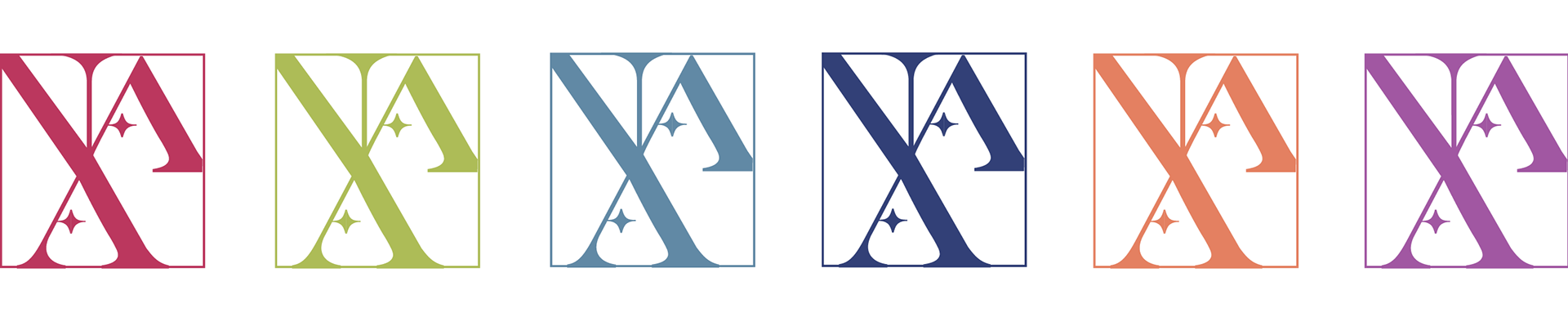
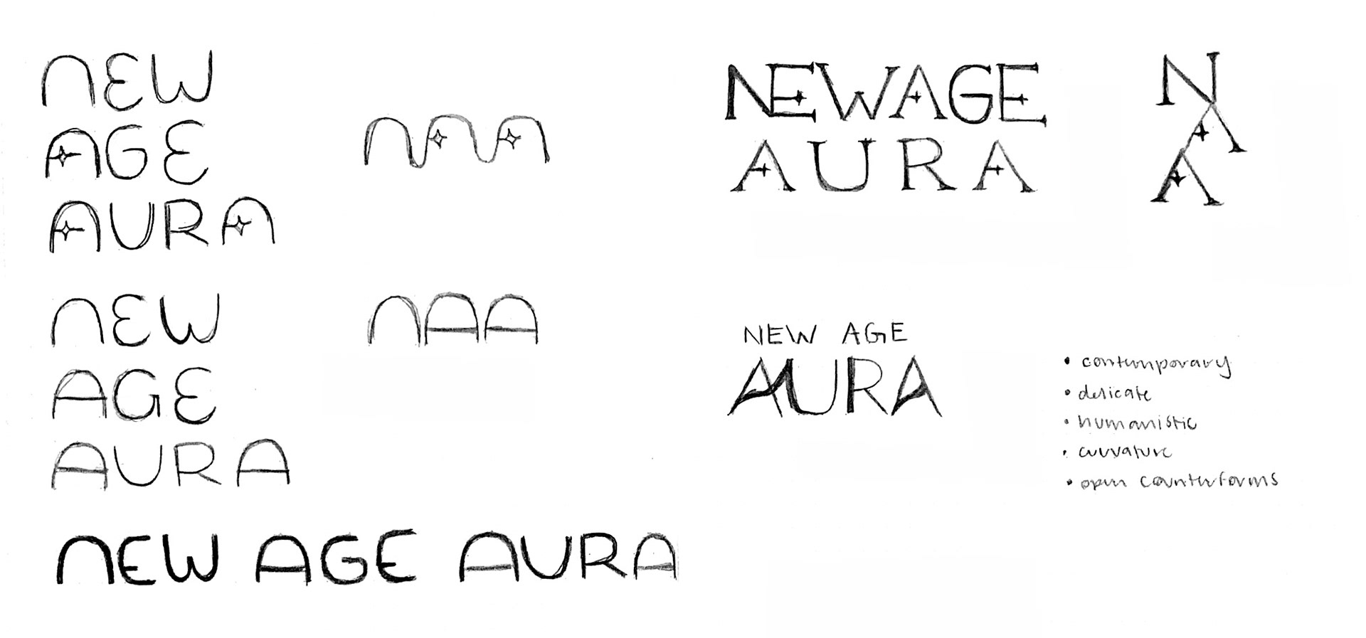
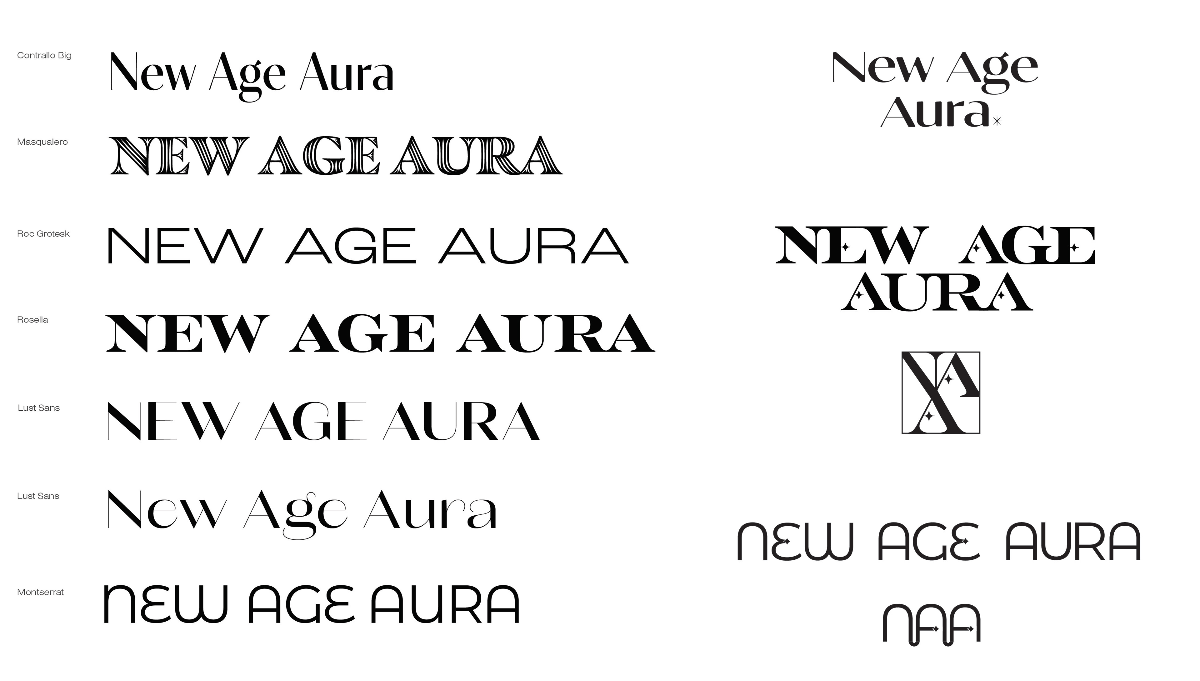
Version 2 (2022): Wordmark Redesign
Began the brand's update by establishing typography attributes and other features to reflect the values and feeling of New Age Aura. Sketched and iterated wordmark/logo options on paper, focusing on the application of the previously established brand identity, as well as the new re-design attributes. Explored typefaces that could apply to the brand identity and updated design attributes.
Began the brand's update by establishing typography attributes and other features to reflect the values and feeling of New Age Aura. Sketched and iterated wordmark/logo options on paper, focusing on the application of the previously established brand identity, as well as the new re-design attributes. Explored typefaces that could apply to the brand identity and updated design attributes.
Version 2 (2022): Aura Card Redesign
Continued in the brand update by re-evaluating the aura card's designs. Using paper and pencil, sketched iterations for the central design, and explored how the base could change for each auric color.
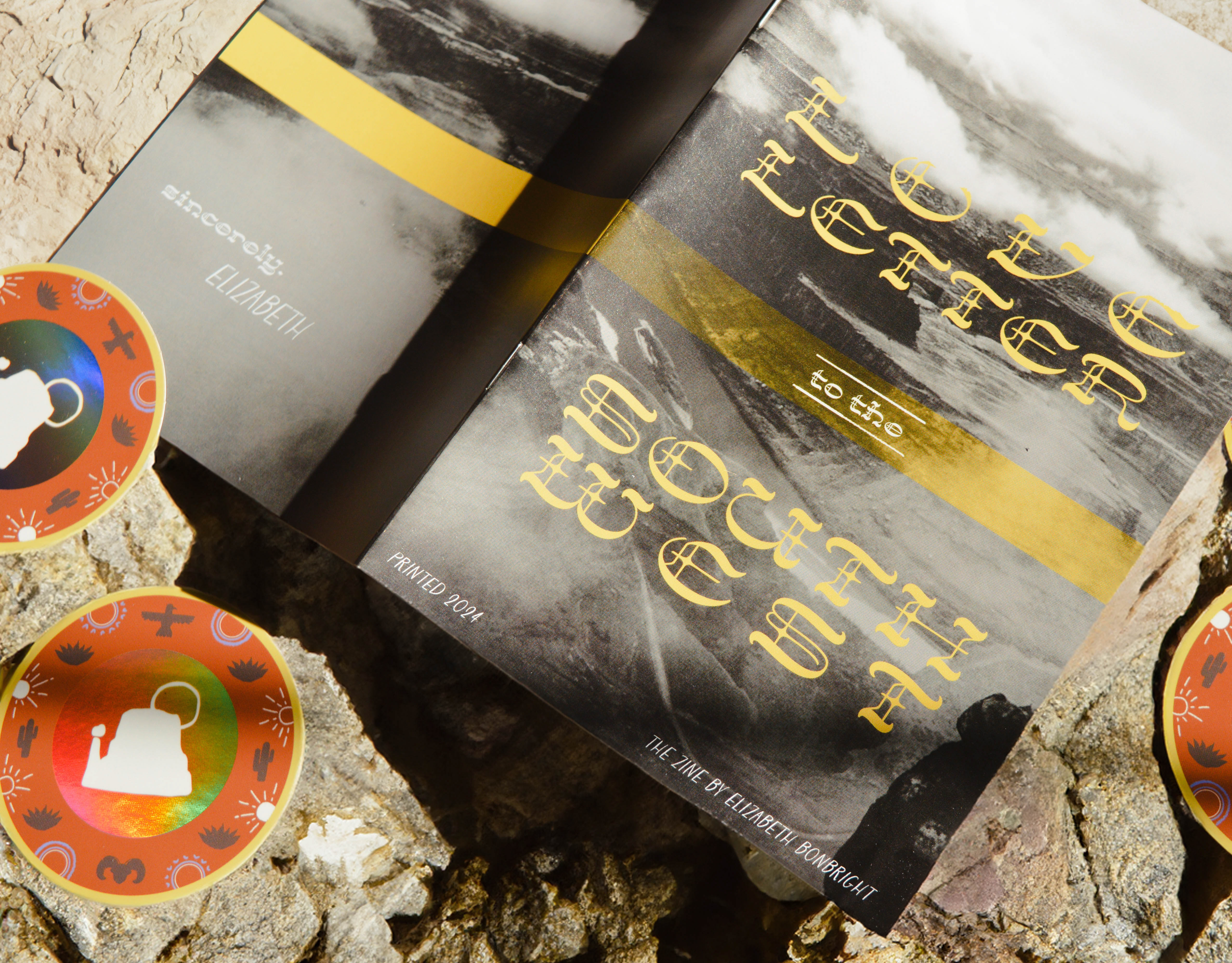
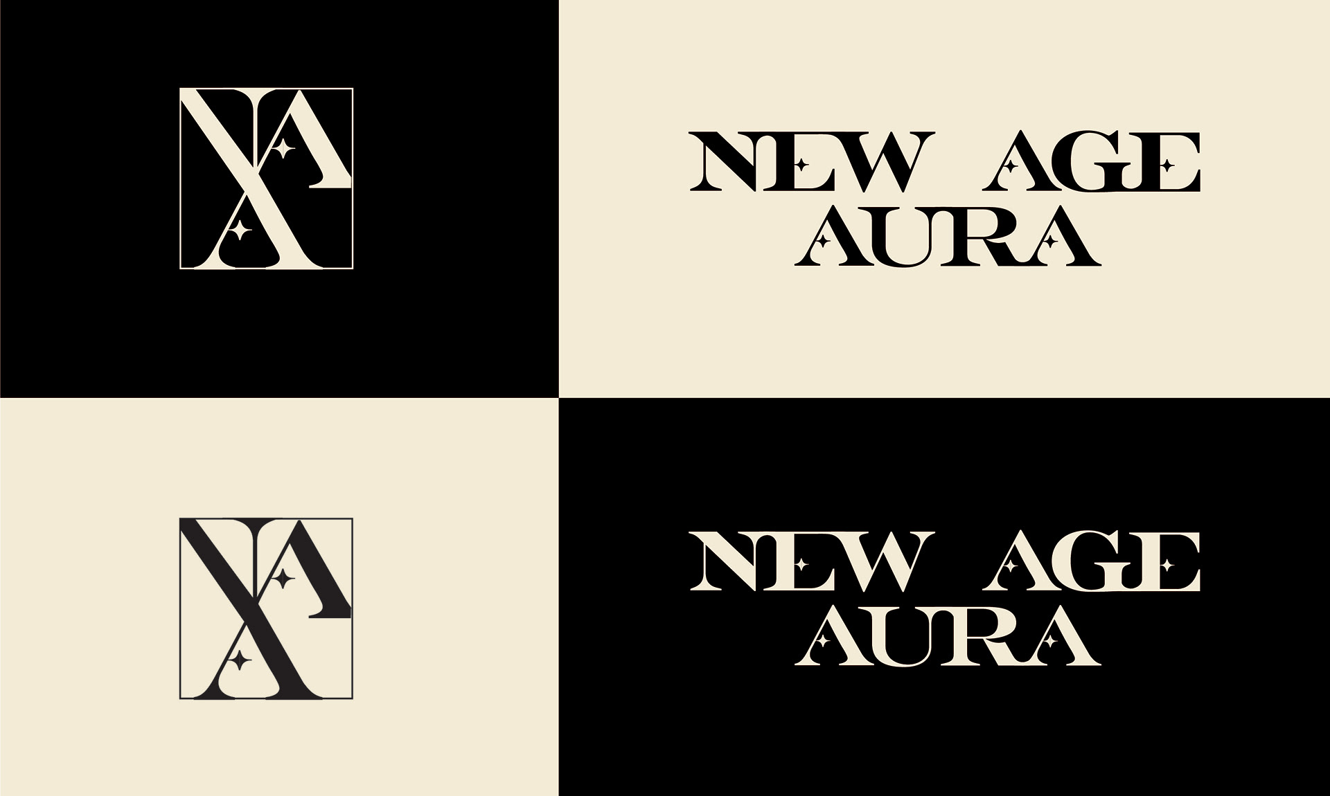
Final Branding and Packaging (2022/2025)